In a time of declining attention spans and 24-hour news cycles, data visualization tools–like interactive maps and infographics–have become powerful communication tools. Traditional maps detail geographic features and transportation infrastructure, but the interactive maps produced by a group of designers, computer scientists, artists, and educators at MIT reveal a more subtle set of details about America's cities.
The project, called You Are Here, is meant to inspire positive change by focusing on what the group calls “markers of a living community.” The maps, which are gorgeously artistic while derived from hard data, show things like the amount of greenery, number of bike crashes, or locations of independent coffee shops.
"…we feel that maps can help people to make their city a better place," explains the group on its website. "Mapping where bike accidents occur might encourage cities to put separate bike lanes where there are lots of accidents. Mapping coffee shops walkingsheds might help the aspiring coffee shop entrepreneur decide where to place her shop. And mapping greenery in the city might encourage people to plant trees where there are none. But mostly — and this is important — we are doing this because it’s fun." Eventually, the Social Computing Group hopes to make 100 maps for 100 cities, or 10,000 maps in total.
This year, we’ve seen Mutual Aid in Motion.
From scaling sharing hubs to Mutual Aid 101 trainings, we’re helping communities build the tools they need.
Every dollar fuels lasting resilience – proving that when we move together, we all move forward.

Browse a selection of You Are Here maps below, then tell us in comments what "markers" or cities you'd like to see them visualize next.

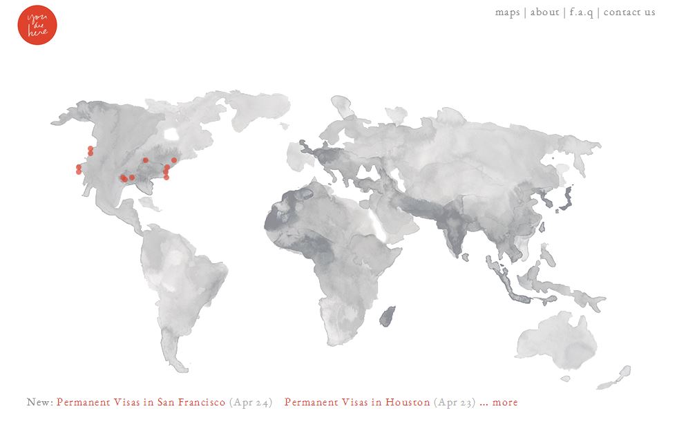
This map visualizes the 1,775 permanent visa applications in Houston in 2012 & 2013. It is the first in a series that depicts one aspect of the untold personal histories that make up our cities: the countries from which people come.
2. Independent Coffee Shops in Philadelphia

Independent coffee shops are positive markers of a living community. They function as social spaces, mobile offices, and places to see the world go by. This map shows the location of independent coffee shops in Philadelphia and the walking-shed communities associated with them.
3. Street Greenery in Portland

Green spaces make a city feel a live, and places with no trees feel barren. This map visualizes the approximate amount of greenery on the streets in Portland, Oregon. The relative amount of greenery at each point is represented by a marker's size and opacity. It might just have been a slow connection, but I especially enjoyed the way this map filled in gradually over about 60 seconds. It was like watching the city bloom!

There were 1,430 reported bicycle crashes in the city of Austin, Texas from 2009 to 2014. By showing where crashes tend to happen — like Guadalupe, Congress Avenue and IH35 — the map team hopes those roads will be made safer for riders.
5. Permanent Visas in New York City

This visualization shows the acceptance rate, job title, origin country, and economic sector of the permanent visa applications for companies in New York City in the years 2012 and 2013. New York City accounts for 6% of the country's total 64,810 visa applications filed during this timespan, though permanent visa applicants account for about 0.05% of New York's population in the same period.

To create this map, the You Are Here team crawled Google Street View images, then ran a simple probabilstic classifier to approximate the amount of visible plant life for each street.
7. Independent Coffee Shops in San Francisco

"Communities are often formed by having spaces in which people can have casual interactions, and local and walkable coffee shops create those conditions, not only in the coffee shop themselves, but on the sidewalks around them," explains the group. "We use maps to know where these coffee shop communities exist and where, by placing new coffee shops, we can help form them."

In order to identify those streets where bike crashes were common, the MIT group used an average-link agglomerative clustering algorithm to cluster the crashes. The large clusters, in which many crashes on a single street length, are shown by a red line. Green lines on the map indicate Chicago's existing bike paths.
You can help the MIT Social Computing Group decide which map to create next! "We start with cities that are highly populated, creative or cultural centers, or centers of industry or government (and importantly, cities where data is available). We are very open, and if you have a city that you’d like us to map, feel free to email us. We’ll add cities where there is popular demand," they explain. Contact them here.