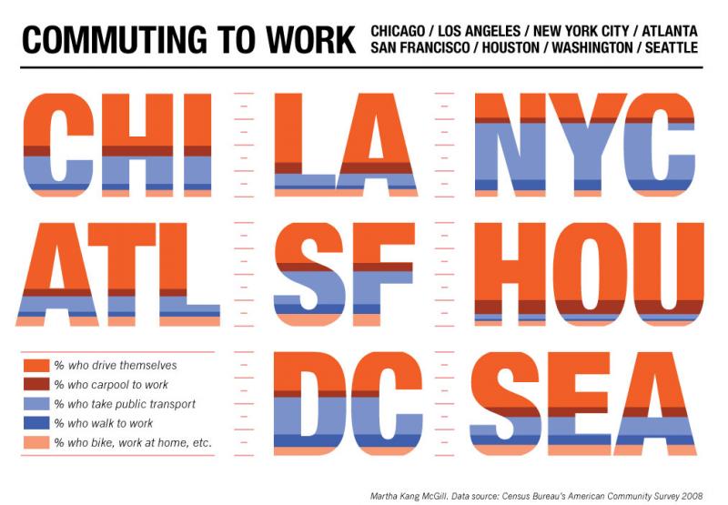
In this fantastic and helpful infographic, artist Martha Kang McGill reveals how the people of eight major U.S. cities get to work, based on numbers from the 2008 U.S. Census Bureau American Community Survey. The people at the bottom of the letters share transportation, through biking, walking, taking public transit, or carpooling. The people at top, represented by the orange, drive themselves.
Thanks, Infrastructurist!