In a recent post about the shutdown of government transparency sites such as data.gov, I wrote about the need for compelling ways of telling the stories buried within open data. Among the citizenry, talk of large datasets tends to inspire glazed-over eyes rather than civic engagement. Google's recent project the Public Data Explorer is an easy and invaluable tool for telling the stories buried in public data, allowing students, journalists and citizens to create their own visualizations without requiring much technical expertise.
Launched in February, the Google Public Data Explorer lets users to create visualizations from a large number of sources, including the World Bank, the U.S. Census Bureau, the U.S. Center for Disease Control, Eurostat and many more. The Explorer allows users to mashup the data using line graphs, bar graphs, maps and bubble charts to create dynamic visualizations, allowing for time-elapsed and interactive visualizations. The tool is extensible, with a custom metadata format that allows deep customization options.
But you don't need to be a geek to get started with the tool. Users browse available datasets through the directory, and can choose to display the data from four visualization types–bar chart, map, bubble chart and line chart. Using simple controls, users can control the time period to visualize, apply filters in the data and choose what metrics to compare in the visualizations. The visualizations are embeddable and easily shared, and the process is surprisingly straightforward, and even fun.
This year, we’ve seen Mutual Aid in Motion.
From scaling sharing hubs to Mutual Aid 101 trainings, we’re helping communities build the tools they need.
Every dollar fuels lasting resilience – proving that when we move together, we all move forward.

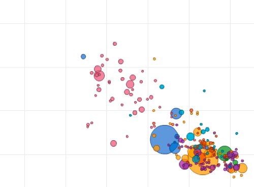
Some sample visualizations made with the tool:
U.S. Unemployment rate 1985-present by age
Overall U.S. Unemployment by state since 2008