United States Commute Patterns for Major Cities. Source: Arturo Ramos, Wikipedia Commons
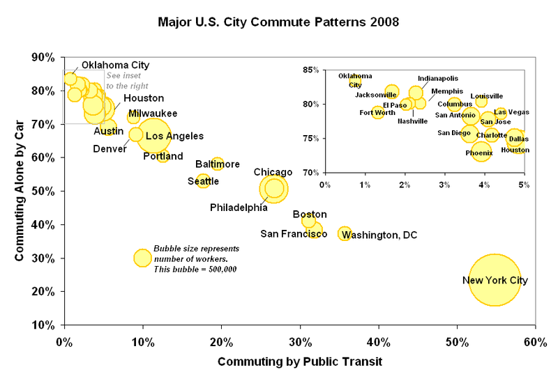
Someday, we may launch an index that attempts to describe how shareable your city is. How many CSAs? How much free wifi? How "smart" is the power grid? How many miles of bike lanes? And so on.
One of the key questions the index would have to answer: How many people share transportation to work? This graph answers that question--and it's instructive to compare it to "Dangerous By Design," which ranks pedestrian safety in 360 cities.
Rate this article
Related Articles
- Interviewed: David Harvey on Rebel Cities
- Hurricane Sandy, Public Banks and Urban Resilience
- How to Map the New Economy in Your City
- Have Your Cake & Eat Someone Else's Too!
- Is Peer-to-Peer Bikesharing Viable?
- Harvesting the City
- Asheville: A Shareable Mountain Town
- Adventures in SideCar-ing
- Honest Buildings: Greener Real Estate by Sharing Data
- Complete Streets Are For Everyone: the Top 10 Policies of 2012
Community Blog Posts
-
By Drew Little
-
By Tim West
-
By Liz Elam
Recent comments
-
2 hours 31 min ago
-
14 hours 9 min ago
-
16 hours 35 min ago
-
19 hours 4 sec ago
-
20 hours 18 min ago


Copenhagen, Odense and Malmo have "green waves" for cyclists meaning that traffic signals give cyclists in the rush direction going 12 mph green lights all the way through to/from work and education.
All these towns have more metres of exclusive bicycle lanes than inhabitants.
Copenhagen is planning for bike motorways - i.e. reducing crossing car traffic by building bridges and tunnels.
Public transport is also about social rights and opening job markets here - by replacing busses with trams it becomes more viable for house wifes to break out of their role and claim a job.
Sharing and redistributing is however done by public institutions to an even higher extent than in the US - and not by common people.